|
|
 |
Modifying Component Icons In The Tool Bar
There are multiple ways in Micro-Cap to select a component for placement in a schematic. One can select
a component by browsing through the Component menu, by clicking on a component name in one of the
component palettes, by searching through the parts with the Find Component command, or by clicking on
a component icon in the tool bar. Each of these methods have advantages, but for basic ease of use,
the component icon method is considered the simplest. The default setup for the component icons tool
bar is displayed below and can be found in the main tool bar for Micro-Cap.
|

|
Each component icon is assigned to a single component. Clicking on one of these icons places the user
in Component mode and ready to place the component that the icon is assigned to into the schematic. While
the component menu and component palettes are controlled through the Component Editor, the component icons
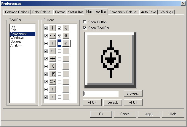
are modified through the Preferences dialog box. The page that controls the settings of the component
icon tool bar can be found by clicking on the Options menu and choosing Preferences. In the Preferences
dialog box, click on the Main Tool Bar tab. Highlight the Component item in the Tool Bar list, and the
settings for the component tool bar are available for editing. The page should appear as below.
|

|
There are a total of 20 possible component icons that may be placed in the main tool bar. Micro-Cap
comes with 12 of these icons predefined with such components as resistors, capacitors, inductors, and
batteries. Any of these component icons may be edited by the user to suit their personal
preferences.
The Main Tool Bar page for the component tool bar consists of six elements. The Buttons section shows
all of the possible icons that are available to place in the main tool bar. A checkbox next to each icon
lets the user display or hide that individual button. The Show Button checkbox performs the same
operation for the selected button. The Show Tool Bar checkbox will display or hide the entire component
tool bar. Below these two checkboxes is the Draw Button area. This area lets the user modify or create
their own graphic for the selected component icon. Clicking on a pixel will toggle that pixel's color
between gray and black. Below the Draw Button is the text field that assigns a specific component to the
selected icon. The component name in this field must match the component name as it appears in the
Component menu. The Browse button invokes the Find Component command to provide a simple way to assign
the component to the icon. Finally, the All On, Default, and All Off buttons provide a quick way to set
the display status for all of the icons in the main tool bar.
Adding a new component icon is an easy process. For this example, the independent current source, I, will
be assigned to an icon and added to the main tool bar. First, select one of the blank icons. Next,
create the design that will be used on the icon in the Draw Button area. For the current source, a
simple source shape with an arrow in the middle of it was used to denote the component as seen above.
The third step is to assign the component name to the icon. The name 'I' can be typed directly into the
field, or the Browse button can be used to find the component. Finally, enable either the checkbox next
to the new icon or the Show Button checkbox. Modifying an existing component icon can be done in the
same manner.
The new component tool bar appears below with the current source icon on the far right. The current
source I is now available for one click selection for placement in the schematic.
|

|
|
|
|
|


